You want a gorgeous wood home more than a kid wants a full-size chocolate bar in his Halloween goody bag, but maybe you’re feeling a little spooked by the size of your wish list. In the end, what you really want is a place that feels homey, but also has that “wow” factor.
According to Hochstetler Log Homes architect and engineer, Steve Lykins, that is the object of the design game: to create the aesthetic experience, which has two distinct components, orientation and surprise. “Orientation is achieved by first creating a feeling of familiarity or comfort,” he says, “then comes the surprise — something unfamiliar or out of the ordinary.”
When crafting a home, there are many “tricks” a designer can use to “treat” their clients to both comfort and surprise. We’ve gone door-to-door for you, asking top log and timber home design authorities for their sweetest pieces of advice. Here are the goods:
TRICK: Stick to a 4-foot design method.
TREAT: Streamline construction and design logic.
“Since most of our roof and floor framing follows a 4-foot spacing,” says Steve, “it is wise to design on a 4-foot module not only for the sake of efficiency during construction (speeding up the process) but also for achieving a clean design aesthetic (logical design).”
TRICK: Install radiant heat … outside.
TREAT: Prolong your outdoor enjoyment.
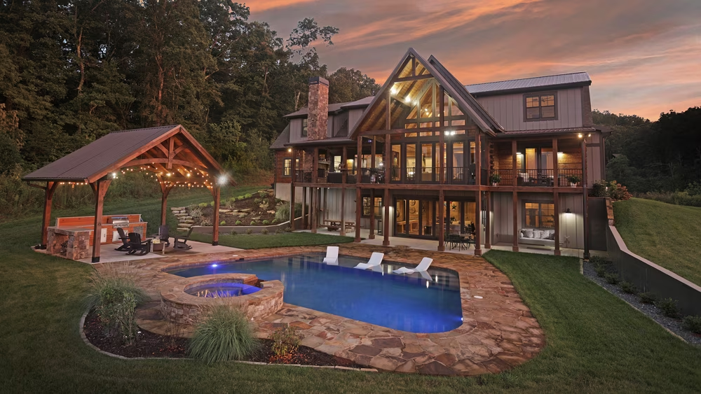
Radiant heat isn’t “new,” but M.T.N Design lead architect Matt Franklin has one suggestion that’s a game changer: Install outdoor radiant heat in the roof of covered porches and patios. “It’s a low-cost way to extend your outdoor season well into cooler months,” he says.
TRICK: Make non-simultaneous use of space — aka “flex space.”
TREAT: Shave space and save money.
“Where spaces don’t have to be used simultaneously, we can treat them as flexible spaces that serve multiple purposes, thereby saving square footage and money,” reveals Steve. Examples include offices that double as hobby rooms, sunrooms that serve as dining rooms, sleeping lofts as rec rooms — and even Jack-and-Jill bathrooms that allow easy access from two or more bedrooms. Matt agrees: “Despite the work-from-home fallout of the pandemic, multiple dedicated home offices are on their way out; flex space is in.”
TRICK: Light it right.
TREAT: Thwart the misconception that wood homes are dark and dreary.
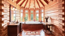
“Determine what you think you need in terms of lighting … then double it,” advises interior designer Rochelle Zemlak, whose eponymous firm specializes in log and timber frame homes. “Of course homes have windows for natural light, but in a heavy-wood home, you have to consider it from various times of day. Find unexpected places to incorporate glass that will allow light to penetrate and have a good electrical lighting plan upfront — especially in a full-log home where it’s not as easy to retrofit down the road.”
TRICK: Aim for a little less “convention” and a little more “invention.”
TREAT: Your home will be uniquely yours.
Just because your home is built with logs or timbers, doesn’t mean it has to fall in some predetermined interior design mold. “Some of my firm’s most exciting projects have been because we’ve broken the rules,’” admits Rochelle.
TRICK: Allow ceilings, not walls, to define your spaces.
TREAT: Achieve an orderly yet open interior — and save money on materials in the process.
“In my little log house in Ellijay, you can stand in one spot and see 10-foot ceilings, 8-foot ceilings with a shed roofline and opposing vaults that converge at the porches,” describes Modern Rustic Homes’ partner and designer Michael Grant. “There’s a lot going on with the ceilings to define the space.”
TRICK: Create diagonal views.
TREAT: Expand your line of sight and make your space feel larger than it is.
“I can be in one corner of my great room and have an uninterrupted diagonal view to the opposite corner of the house, making the cabin feel much more spacious. It works!” Michael says.
But what’s the ultimate “trick”? According to Rochelle, it’s to simply relax and have fun with the design. “Log and timbers have such strong personalities on their own, they need a little jolt,” she says with a laugh. “When clients allow their own personalities to be the star of the space — that’s what makes people fall in love with these homes. Let the wood set the stage and then be the backdrop.”
Treat Your Home to These Eight Extra Design Tricks

1. Experience is everything
While many designers focus on the components that go into a house, interior designer Rochelle Zemlak, proprietor of Rochelle Lynn Design (RLD) takes a more philosophical approach with clients: “Often we miss the mark regarding how we are going to act in a given space. From the beginning, I tell people not to think about the ‘things’ they put in a house; be more concerned about the experience, because there are a lot of things you think you need that can be achieved without actually having them, if you focus on the experience of them.”
Trick: Replace rooms with a singular purpose with functional spaces that satisfy on several levels.
Treat: This goes for anything from main living areas to storage zones. By really thinking about what kind of experience you need a space to provide you, you’ll be able to operate efficiently within your home.
Modern Rustic Homes photo by Tom Harper

2. It’s ok to mesh around
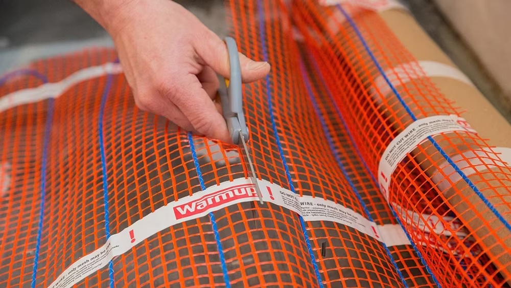
No one likes to step on a cold bathroom floor on a frosty winter morn, and while radiant in-floor heat has been around for a while, Matt Franklin takes a different approach.
Trick: Install electric mesh beneath the bathroom tile floor.
Treat: Large-scale radiant heat is usually liquid based, using tubing that runs within the subfloor; but for a smaller areas like bathrooms (or if you’re building on a slab), a radiant mesh is an easier and economical alternative. You also can install it in strategic spots, like just under the kitchen sink or stove, for an extra helping of luxury for minimal cost.
Warmup photo

3. Bunk up
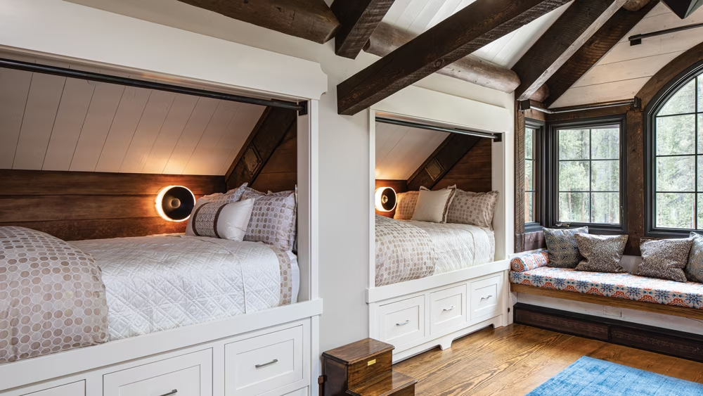
Bunkrooms are gaining popularity, especially when the homeowners have grandkids or host guests who have children, according to M.T.N Design lead designer Matt Franklin.
Trick: Create a room large enough to contain four to six beds and central place where they can play games, be loud and just be kids. Often these rooms are placed over the garage or far away from the central core of the house.
Treat: “People are really going all out in these spaces, equipping them with built-in bunks with sconces and charging stations for each bed. The spaces are thoughtful,” says Matt. Plus, when properly placed within the floor plan, extra soundproofing measures should not necessary to ensure everyone’s comfort, saving you money on structural components.
Photo by James Ray Spahn

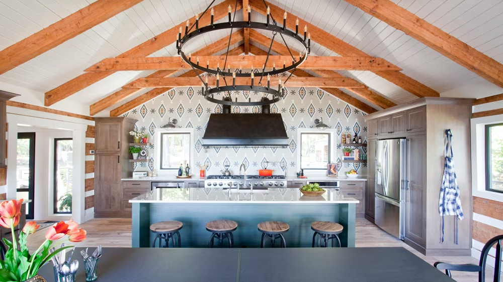
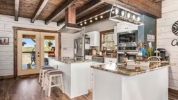
4. Ax the upper cabinets
Matt says that homebuyers are continuing to eschew banks of upper cabinetry in their home’s kitchen.
Trick: If you nix the kitchen uppers, integrate storage in other ways, such as open shelving and/or a large walk-in pantry for overflow.
Treat: Cabinets are expensive, so by reducing the number you have, you can reallocate those budget funds to other areas of construction, as well as make your kitchen feel larger and more open.
Photo courtesy of Christina Wedge and Chip Wade

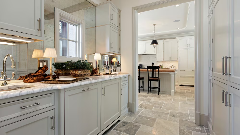
5. Build in a butler’s pantry
While very few of us will have an actual butler on staff, designers will tell you that this is an old-school concept that’s making a big comeback, thanks to its practicality.
Trick: Blur the lines of kitchen design.
Treat: Don’t think of this space as merely a place to store dry goods. A real butler’s pantry is an extension of the kitchen, complete with counter tops, a prep sink and the ability to house appliances small and large. If well appointed, a butler’s pantry can pull double duty as a serving station that passes between the kitchen and living/dining areas — perfect for larger buffet-style gatherings at the holidays.
Photo: AdobeStock_37428087

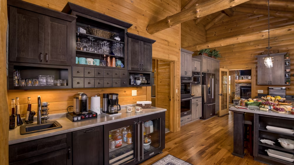
6. Location, location, location
Everyone has heard this phrase regarding real estate, but it’s just as relevant inside the walls of a home, i.e., where certain elements are within its layout. Rochelle uses the example of integrating a coffee/beverage station: “I advise clients to place these on the perimeter of a kitchen’s layout or even in a separate area between the kitchen and an entertaining space. Assign specific storage for cups and coffee and enough outlets for coffee and/or espresso machines, as well as a beverage cooler. It won’t need a lot of space, but having a separate area for things that are not part of meal preparation or cleanup means they won’t get in the way of each other.”
Trick: While reviewing plans or designing from scratch, envision how you (and others) will use each individual space.
Treat: This simple practice will allow you to achieve better flow and greater satisfaction with your home – even in a smaller footprint.
Hochstetler Log Homes photo by Kris Miller

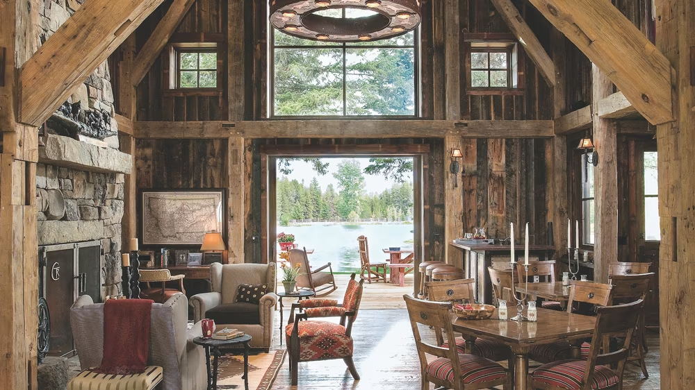
7. Expand your horizons
Line of site is something from which every home can benefit, and this applies both to interior spaces and from inside out. It’s a good idea to blur the lines between the indoors and the outside world, but in a log or timber home, it’s practically a requirement, as so many of them have exceptional views.
Trick: Practice smarter window and door placement.
Treat: “The more glazing you have in a house, the more your eyes extend beyond the walls, making your home feel expansive even if it’s not large,” advises Michael Grant, a partner and designer at Modern Rustic Homes.
Home by Wildwood Eccentrics; Photo by Heidi Long

8. A bump in the right direction
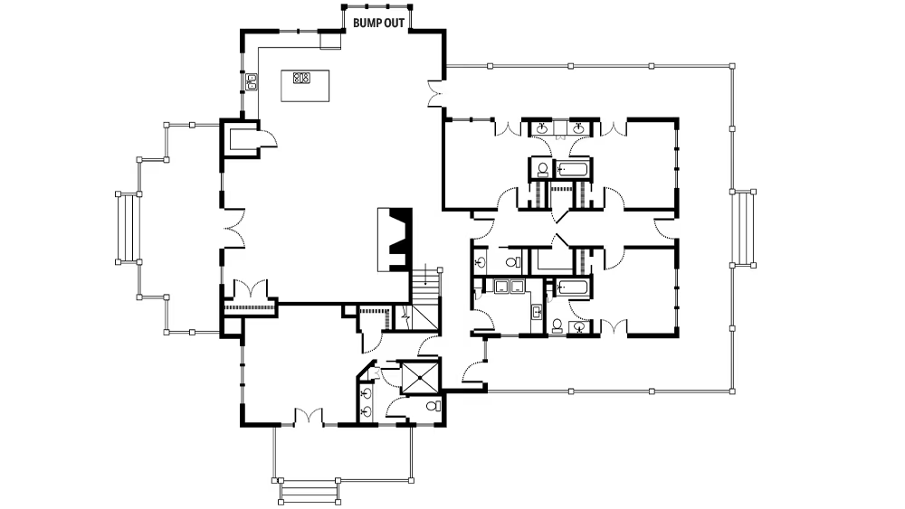
“Time and again, I’ve heard homeowners say, ‘If this room were only two feet bigger, it would be perfect.’ I call it the two-foot rule,” shares Michael. But he says that often they don’t need the entire room to be larger, just certain parts of it. Bump outs, whether they are part of the foundation/footprint of a home or a cantilevered space above grade, are a great option to gain that extra square footage that makes a room feel perfect.
Trick: Add a bump out to gain a little extra elbow room
Treat: Not only will a bump out give you a boost of space inside, it also will lend a whole lot of character and interest to your exterior facade — all for a lot less money than a full expansion.
Mid-Atlantic Timber Frames plan
Previous
Next
1. Experience is everything
While many designers focus on the components that go into a house, interior designer Rochelle Zemlak, proprietor of Rochelle Lynn Design (RLD) takes a more philosophical approach with clients: “Often we miss the mark regarding how we are going to act in a given space. From the beginning, I tell people not to think about the ‘things’ they put in a house; be more concerned about the experience, because there are a lot of things you think you need that can be achieved without actually having them, if you focus on the experience of them.”
Trick: Replace rooms with a singular purpose with functional spaces that satisfy on several levels.
Treat: This goes for anything from main living areas to storage zones. By really thinking about what kind of experience you need a space to provide you, you’ll be able to operate efficiently within your home.
Modern Rustic Homes photo by Tom Harper


