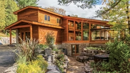
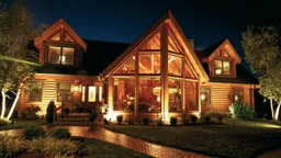
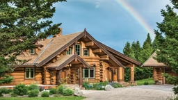
 With its front-row seat to the action on the links, it’s always tee time on the patio. Unadorned steppingstones and a few concrete planters—both in sync with the cabin’s natural look—create a subtle transition between the private property and the golf course just a few feet away.
Translation: The Golden State expat sought all the charm of a cabin, but none of the rustic materials or folksy flourishes often used to achieve it. Thanks to a close collaboration between homeowner and architect — as well as a clear-eyed understanding of the architect and builder Chad Rothacher, owner of Big Sky-based RMR Group, how best to create a look that’s both upscale and down-to-earth — that initial request was fulfilled spectacularly.
Economies of Scale
“I think everything comes back to proportion,” says Locati, explaining his design approach for the cabin, nestled in the Gallatin Valley. “A lot of times, ‘contemporary’ doesn’t lend itself to a homey feel, and that’s where the scale of the windows and rooms comes into play.” Because the home is just 1,509 square feet, the architect’s challenge wasn’t to make a grand space seem cabin-like; it was to make a cabin seem grand. “In a cabin design, square footages are small, and yet the spaces don’t have to feel small because you really play off the other rooms,” Locati explains. “In this home, the living room, dining room and kitchen are very open to each other, so each room feels bigger than it would if it were in a more formal type of setting.”
“I think everything comes back to proportion,” says Locati, explaining his design approach for the cabin, nestled in the Gallatin Valley. “A lot of times, ‘contemporary’ doesn’t lend itself to a homey feel, and that’s where the scale of the windows and rooms comes into play.” Because the home is just 1,509 square feet, the architect’s challenge wasn’t to make a grand space seem cabin-like; it was to make a cabin seem grand. “In a cabin design, square footages are small, and yet the spaces don’t have to feel small because you really play off the other rooms,” Locati explains. “In this home, the living room, dining room and kitchen are very open to each other, so each room feels bigger than it would if it were in a more formal type of setting.”
That openness was essential to the homeowner, who consulted frequently with Locati during the design process to ensure his wishes were known. Along with giving the single-level cabin an airy living area and floor-to-ceiling windows and sliders, the architect added extra-wide pocket doors to its two bedrooms that, when opened, turn the sleeping spaces into a continuation of the common area. The result? A sweeping interior on a footprint no bigger than some homes’ master suites.
Materials Matter
Just as important as the cabin’s design were the materials used to bring that design to life. Although the homeowner (who has since sold the property) insisted on using natural materials, he didn’t want anything too rugged that might detract from the place’s chic look. “We typically stay pretty close to natural materials — a lot of wood, stone and glass — on our projects,” Locati states. Clean-lined versions of each achieve a modern look. The architect cloaked the cabin’s high ceilings in sleek fir planks, selected smooth cedar siding for the exterior and opted for a flat metal roof to top it all off. On the cabin’s front and rear facades, metal-clad windows framing expansive views of five mountain ranges complete the posh vibe, but not at the expense of coziness. And throughout the space, mottled-gray concrete floors lend an industrial, yet cozy, touch. “More than the materials, it’s the design that creates warmth,” says the builder, meaning that even rock-hard concrete, when handled skillfully, becomes inviting.
Just as important as the cabin’s design were the materials used to bring that design to life. Although the homeowner (who has since sold the property) insisted on using natural materials, he didn’t want anything too rugged that might detract from the place’s chic look. “We typically stay pretty close to natural materials — a lot of wood, stone and glass — on our projects,” Locati states. Clean-lined versions of each achieve a modern look. The architect cloaked the cabin’s high ceilings in sleek fir planks, selected smooth cedar siding for the exterior and opted for a flat metal roof to top it all off. On the cabin’s front and rear facades, metal-clad windows framing expansive views of five mountain ranges complete the posh vibe, but not at the expense of coziness. And throughout the space, mottled-gray concrete floors lend an industrial, yet cozy, touch. “More than the materials, it’s the design that creates warmth,” says the builder, meaning that even rock-hard concrete, when handled skillfully, becomes inviting.
Clear Communication
Materials and layout aside, the architect says his regular conversations with the homeowner played a key part in the project’s success. “It was definitely a collaboration,” Locati recalls. “When the homeowner first wanted to design this house, it was kind of on the leading edge. There were no contemporary homes in the community, yet this one blends in with the other cabins.” The fact that it does only confirms what cabin owners already know: that cabins aren’t about a particular style — they’re about a lifestyle. One where intimacy trumps enormity, where the personal beats the palatial. And one where effective communication can lead to a show-stopping home like this one. “Architects are only as good as their clients let them be or the direction they let them go in,” Locati states. “A big part of that is having clients with a sense of design as well, and we had that on this project.”
Materials and layout aside, the architect says his regular conversations with the homeowner played a key part in the project’s success. “It was definitely a collaboration,” Locati recalls. “When the homeowner first wanted to design this house, it was kind of on the leading edge. There were no contemporary homes in the community, yet this one blends in with the other cabins.” The fact that it does only confirms what cabin owners already know: that cabins aren’t about a particular style — they’re about a lifestyle. One where intimacy trumps enormity, where the personal beats the palatial. And one where effective communication can lead to a show-stopping home like this one. “Architects are only as good as their clients let them be or the direction they let them go in,” Locati states. “A big part of that is having clients with a sense of design as well, and we had that on this project.”
Resources:
Square footage: 1,509
Bedrooms:
2 Bathrooms: 1
Architect: Locati Architects (406-587-1139; locatiarchitects.com)
Builder: RMR Group (406-995-4811; rmrgroup.net)
Community: Black Bull (406-556-5011; blackbullbozeman.com)
Square footage: 1,509
Bedrooms:
2 Bathrooms: 1
Architect: Locati Architects (406-587-1139; locatiarchitects.com)
Builder: RMR Group (406-995-4811; rmrgroup.net)
Community: Black Bull (406-556-5011; blackbullbozeman.com)

