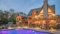
Photos courtesy of Zach Parmeter
You’ve heard it a million times: It’s what’s inside that counts. That’s why, after covering the exterior finishes of Zach Parmeter’s home in our June issue, we’re now showing off the inside of his log-and-timber hybrid. But we’re not simply giving you a run-down of his personal choices, we’re divulging his best tips for creating hardworking, good-looking interiors in your own home.
In his role as design coordinator, Zach recommends his clients kick off the process of choosing interior finishes by nailing down a look they love. He suggests perusing magazines and websites, not to mention watching home design shows on television, to get a feel for what you love — and what you don’t.
For Zach, pursuing that process on his own led him to develop a style preference he refers to as “Tuscany timber.” He explains: “It has a little bit of European, specifically Spanish, flair to it. It feels warm and welcoming, and, most importantly, it meshes well alongside the Craftsman-style timber elements, which were my first priority.”
Knowing he wanted to infuse his interiors with Old World flair while keeping the timbers front and center, Zach was able to narrow down his design decisions significantly. “Because I wanted the timbers to catch your eye first, I kept the other elements pretty simple,” he says, pointing to his drywall treatment. “I used a neutral paint with a heavy skip-trowel finish to give it that Old World style but still keep the walls muted.”
To reinforce the Tuscan treatment, he chose rustic, hand-scraped hickory wood floors, as well as large-format, textured tile for rooms like the laundry area, mudroom and master bath. By contrast he incorporated smaller-scale tile in a herringbone pattern for the guest bath to keep from overwhelming the tiny space. To anchor the home’s flooring and impart a rustic feel, Zach selected oversized, 8-inch-wide baseboards with worn edges — the same size and style used as a window and door trim.
In the kitchen, he placed thick-edged Corian countertops alongside rustic alder cabinetry. Alternate materials and tones on the center island — a Quartz slab and dark stain — bring contrast to the space. “When it comes to picking finishes, you’re always working to find a balance between contrast and busy-ness,” says Zach. The best advice he applied in his kitchen? “Focus on a few impactful, memorable elements but keep everything else muted.” Two of the most eye-catching features in the space are the reclaimed pine ceilings and the stone range hood, while the backsplash plays a visually quiet role — something that Zach says reveals an essential lesson in interior design: Go with your instincts.
“One of the subcontractors suggested I do a mosaic backsplash in the kitchen, but I knew it would detract from the range hood,” he says. “Sometimes, the professionals you’re working with may not understand how everything is meant to come together, so you have to trust your gut.”
Zach encourages his clients to lean into their intuition when it comes to choosing among the myriad interior finishing decisions they’ll inevitably make during the building process. “Decision paralysis comes in when you don’t trust yourself,” he explains, “but you have to remember that you have the best step up on making choices, because you know how you want it to look when it’s all said and done.”
Plus! Tricks of the Trade:
Check out Zach Parmeter’s top three pro tips for simplifying the interior selections process:
1. Look at every interior finish decision as a part within the whole. You may love a certain tile or paint color as an individual element, but before giving it the go-ahead, think through how it will fit into the overall design scheme you want for your home.
2. Think beyond aesthetics. Consider your lifestyle, including functionality and mobility, when making choices. Remember, you have to live with the materials you choose, not just look at them. For example, you may love the look of marble countertops in a kitchen, but do their maintenance requirements fit your daily routine?
3. Invest your budget where it matters. You don’t want to splurge on expensive finishes for a guest bathroom if it means skimping on the master suite. Place more costly items in high-visibility areas and places where you’ll spend the most time. The kitchen, living room and master bedroom are common spots where splurging makes sense.


